Email marketing is a cornerstone for many businesses, but crafting emails that truly convert is an ongoing challenge. With over 5,000 email designs tested across hundreds of clients, this article distills 23 proven design strategies to help marketers, businesses, and email service providers boost engagement and drive more sales. Whether you’re an e-commerce entrepreneur or a seasoned digital marketer, these transformative tips can elevate your email campaigns from good to exceptional.
From the psychology of personalization to optimizing for mobile users, we’ll break down the key hacks that prioritize clarity, user experience, and conversions. By implementing these techniques, you can maximize your email marketing ROI while delivering value to your audience.
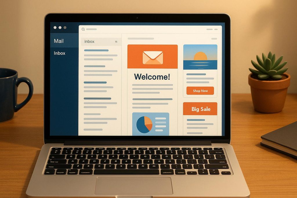
Why Email Design Matters
In today’s fast-paced digital ecosystem, consumers are bombarded with hundreds of emails daily. Standing out requires more than just compelling copy – your email’s design must guide readers’ attention, evoke trust, and inspire action. A poorly designed email risks being ignored or, worse, flagged as spam. Proper design not only ensures your message is seen but also enhances user experience, builds credibility, and fosters higher engagement with your content.
Below, we’ll explore 23 actionable design strategies to improve email performance. These tips are based on real-world data and insights to help you create emails that people open, click on, and ultimately convert.
23 Email Design Hacks to Boost Conversions
1. Leverage Countdown Timers to Create Urgency
Countdown timers are a visual and psychological powerhouse for driving urgency. Incorporating dynamic, animated timers in emails for promotions, abandoned cart reminders, or limited-time offers can tap into FOMO (fear of missing out). Tools like Mailtimers.com make this easy to implement.
- Best Use Case: Abandoned cart or flash sales.
2. Personalize with the Recipient’s First Name
Using the recipient’s first name in the subject line, header, or email body can make mass emails feel personal. This strategy, rooted in the "cocktail party effect", captures attention and fosters connection.
- Example: "Hey Sarah, don’t miss this!"
3. Experiment with Plain Text Emails
While not visually flashy, plain text emails mimic personal communication and can feel more relatable. This format is also better at bypassing spam filters.
- Pro Tip: Keep branding minimal and focus on conversational language.
4. Eliminate Dead Space
Wasted space in emails – large headers or unnecessary elements – can dilute the message. Pack valuable content into the first visible section (hero section) to grab attention immediately.
- Actionable Tip: Keep CTAs prominent and avoid clutter.
5. Incorporate Numbers in Copy for Credibility
Numbers grab attention and lend credibility. For example, "Save 30%" is more compelling than "Save money." Use statistics, ratings, and concrete figures to anchor your message.
- Example: "Join 10 million happy customers."
6. Increase Font Size for Mobile Readability
With most emails now opened on mobile devices, font size plays a critical role in readability. Ensure your fonts are at least 16 pixels or larger, particularly for mobile-first audiences.
7. Focus on Benefits, Not Just Features
Features tell readers what the product or service does, but benefits explain why they should care. Tie each feature to a customer-centric outcome.
- Example: Instead of "waterproof", say, "Stay dry in any weather."
8. Ease Purchase Anxiety
Reduce friction by addressing potential customer hesitations. Include language like "free shipping", "hassle-free returns", or "no commitment required" to build trust.
- Quick Fix: Replace "Buy Now" with less pressuring CTAs like "Add to Cart."
9. Invest in Premium Design
Professional, cohesive design reflects the quality of your product. Avoid poorly designed emails that can erode trust and make your brand seem unprofessional.
- Tip: Match your email design to your website’s branding.
10. Make It Easy to Buy
Provide multiple CTAs (call-to-action buttons) throughout the email to ensure readers can act whenever they feel ready to convert.
- Key Reminder: Don’t bury your only CTA at the bottom of the email.
11. Optimize for Mobile Devices
Given that over 60% of emails are opened on mobile, ensure a "thumb-friendly" design with single-column layouts, large buttons, and mobile-friendly images.
12. Layer Information Strategically
Avoid overwhelming readers by structuring your email in digestible chunks. Present the offer or key message upfront, then layer additional details for those who scroll further.
- Best Practice: Use "read more" links or collapsible sections.
13. Prioritize Headlines and Preview Text
Your subject line, headline, and preview text are the most critical elements for grabbing attention. Spend extra time crafting these to ensure they’re clear, compelling, and actionable.
14. Use Visual Flow to Guide Attention
Leverage font sizes, colors, and layout to guide the reader’s eyes toward key elements like benefits and CTAs. A clear hierarchy ensures logical navigation.
15. Showcase Social Proof Early
Displaying social proof (e.g., testimonials, star ratings, or customer counts) near the top of the email can instantly build trust and credibility.
16. Utilize Infographics for Clarity
Infographics simplify complex information and make your emails more visually engaging. Use them to compare products, highlight benefits, or tell a story quickly.
17. Use Specific and Authentic Testimonials
Generic testimonials like "Great product!" lack impact. Instead, use detailed and relatable testimonials that align with your email’s key message.
18. Commit to Testing
Testing drives improvement. Experiment with subject lines, CTA placement, copy variations, and offers to learn what resonates most with your audience.
- Pro Tip: Test one variable at a time to pinpoint results.
19. List FAQs to Address Objections
Preemptively answer common customer questions or concerns to reduce hesitation. Addressing FAQs directly in the email can ease decision-making.
20. Highlight Real Testimonials and UGC
Real photos, videos, or quotes from customers add authenticity. In an era of skepticism, this human element can make a significant difference.
21. Optimize for Dark Mode
With dark mode gaining popularity, ensure your emails are legible and visually appealing for users who prefer this setting.
22. Make Buttons Bigger
For mobile users, larger buttons improve accessibility and click-through rates. Ensure CTAs are at least 44 pixels tall for optimal usability.
23. Place CTAs Above the Fold
Don’t wait for readers to scroll. Placing your CTA (e.g., "Shop Now") in the initial viewport ensures maximum visibility.
Key Takeaways
- Countdown timers create urgency and drive action.
- Personalization (e.g., using first names) enhances engagement.
- Plain text emails can improve deliverability and feel more personal.
- Prioritize mobile optimization with larger fonts, buttons, and responsive layouts.
- Use numbers and social proof to build credibility and guide decision-making.
- Reduce friction with clear CTAs, benefits-focused copy, and preemptive FAQ sections.
- Invest in premium designs that align with your brand.
- Always test and iterate to uncover what works for your audience.
Conclusion
In 2025, email marketing remains a critical revenue-driving channel, but success hinges on a blend of strategy, psychology, and design. These 23 email design hacks provide actionable insights to elevate your campaigns, engage your audience, and drive conversions. By focusing on user experience, reducing friction, and designing with intention, email marketers can unlock untapped potential in their campaigns.
Source: "23 Email Design Hacks To Increase Conversions INSTANTLY" – Aaron Bermingham, YouTube, Aug 25, 2025 – https://www.youtube.com/watch?v=tTO9RQwpQyw
Use: Embedded for reference. Brief quotes used for commentary/review.
