
Key Takeaways:
- Use clear, benefit-focused language: Replace “Click here” with “Get my free guide.”
- Stick to one main CTA: Avoid overwhelming readers with too many options.
- Make CTAs visible: Use bold buttons, strong contrast, and place them above the fold.
- Optimize for mobile: Ensure buttons are thumb-friendly and easy to tap.
- Create urgency: Add time-sensitive phrases like “Only 10 spots left.”
Even minor tweaks, like switching to first-person language (“Start my free trial”), can boost clicks by up to 90%. Focus on clarity, simplicity, and testing to maximize your email performance.
What Makes A Good Email CTA Button? – TheEmailToolbox.com
Common CTA Mistakes and How to Fix Them
Email CTA Mistakes vs. Optimized Solutions with Performance Data
CTAs play a crucial role in guiding user action, but they’re often mishandled. Let’s dive into some common mistakes and how to address them effectively.
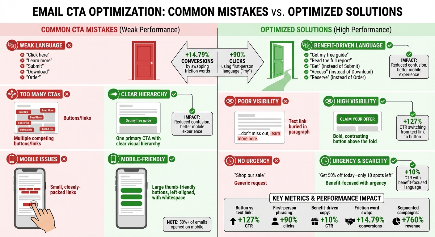
Weak or Generic CTA Language
Phrases like "Click here" or "Learn more" don’t communicate value. Even worse, words like "Submit", "Download", or "Order" can feel like extra work rather than an opportunity.
The solution? Focus on benefits over effort. For instance, replace "Download" with "Get", "Order" with "Reserve", or "Apply" with "Learn." Marketing expert Michael Aagaard found that swapping just one friction word for a benefit-driven alternative led to a 14.79% boost in conversions [1]. Using first-person phrasing, like "Get my free guide", can also make CTAs more engaging.
Keep your CTAs short – ideally 2 to 5 words – and use action-driven verbs like "Try", "Get", "Join", or "Read." Be specific about the next step. For example, instead of "Read more", say "Read the full report."
| Friction Word (Avoid) | Better Alternative | Benefit-Focused Example |
|---|---|---|
| Submit | Get | Get my free guide |
| Buy | Shop | Shop the collection |
| Download | Access | Access my report |
| Register | Join | Join the community |
| Order | Reserve | Reserve my spot |
Too Many CTAs in a Single Email
Overloading an email with multiple CTAs can overwhelm readers, leading to inaction. Each additional option pulls attention away from your main goal, and on mobile, closely packed links can cause accidental clicks.
The fix? Stick to one primary CTA per email. If secondary links are necessary, create a clear visual hierarchy. Make the primary CTA stand out by using a larger, brightly colored button with ample whitespace around it. This approach keeps the focus clear and reduces frustration on mobile devices.
Design your email layout to naturally guide readers toward your main CTA, ensuring it’s the most prominent element on the page.
Poor CTA Visibility and Placement
If your CTA doesn’t catch the eye or is buried at the bottom of the page, it’s likely to be missed. To fix this, ensure your CTA stands out with strong contrast, bold colors, or increased size. Campaign Monitor’s internal testing found that switching from a hyperlinked text CTA to a button increased click-through rates by 127% [4]. Buttons are visually more engaging and easier to spot.
Whenever possible, place your CTA above the fold or right after your key value proposition. This ensures that both skimmers and detailed readers can quickly find where to click.
Ignoring Mobile Optimization for CTAs
With mobile devices accounting for over half of email opens, optimizing CTAs for smaller screens is non-negotiable. Mobile users tend to scan quickly, so your CTAs need to be easy to spot and tap.
Design large, thumb-friendly buttons that can be tapped with one hand. Left-aligning CTAs can further enhance usability for one-handed scrolling. Avoid relying solely on image-based CTAs, as about 85% of email clients block images by default. If you do use images, include actionable alt-text like "Download Ebook Now" to ensure functionality.
Keep mobile CTA copy concise (3 to 5 words) and surround buttons with enough whitespace to prevent accidental clicks.
Lack of Urgency or Specificity in CTAs
CTAs without urgency often fail to inspire immediate action. If there’s no reason to act now, readers may delay – and delay usually means no action at all. Add time-sensitive phrases like "Now", "Today", or "Limited time" to encourage quick responses. For example, instead of "Shop our sale", try "Get 50% off today", or replace "Join our webinar" with "Reserve my spot – only 10 left."
Specificity also matters. Highlight the exact benefit or outcome to make the offer more compelling. Studies indicate that benefit-focused language can increase click-through rates by around 10% [1].
Campaign Monitor: "A link or button is a promise. People expect certain things from you when they tap that button." [6]
Advanced CTA Optimization Techniques
Once you’ve addressed the basics, it’s time to explore advanced strategies to make your CTAs even more effective. Techniques like audience segmentation and behavioral targeting can significantly improve how well your CTAs perform by tailoring them to fit each subscriber’s needs.
Segmenting Audiences for Personalized CTAs
Generic CTAs often fall flat compared to personalized ones. In fact, segmented email campaigns can generate up to 760% more revenue than their non-segmented counterparts [6]. Think about it: it’s much easier to grab the attention of a targeted group of 10 people than a broad, unfocused list of 100 [6].
Start by segmenting your audience based on demographics like age, location, or interests. But don’t stop there – dig deeper into behaviors such as purchase history, browsing activity, or email engagement. Campaigns that use both demographic and behavioral segmentation often see 14.31% higher open rates and a 100.95% jump in click-through rates compared to non-segmented efforts [9].
Once you’ve divided your audience, craft CTAs that address each group’s specific needs. For instance, new leads might respond to "Activate my free trial", while loyal customers may prefer "Get 20% off your next order."
Testing is key here. A/B test different CTA phrases across your segments to see what resonates. For example, fashion enthusiasts might click on "Revamp your wardrobe", while bargain shoppers gravitate toward "Save on favorite styles" [6]. Also, consider the complexity of your offer. Simple actions, like reading a blog post, align well with CTAs placed early in your content. More involved decisions, like signing up for a product demo, may require additional context before introducing the CTA [1][8].
Starting with Low-Commitment CTAs
Jumping straight to high-stakes CTAs like "Buy now" can scare off subscribers who aren’t ready to take that leap. Low-commitment CTAs offer a softer approach, encouraging engagement without overwhelming the reader. This is especially effective for mid-funnel subscribers who need more nurturing before converting [1].
Swap out high-pressure words for more inviting alternatives. Instead of "Buy", try "Explore." Replace "Order" with "Reserve" or "Get." These subtle changes shift the focus to what the reader gains, making the next step feel less daunting [6][1]. For complex products, consider CTAs like "See it in action" or "Learn how it works" to build trust and keep subscribers engaged in your funnel.
"Every email is a sales email… every email should lead to a final conversion, whether that’s a sale, a donation, or an in-app action." – Joanna Wiebe, Founder, Copyhackers [5]
Highlighting Clear Benefits and Value Propositions
A great CTA emphasizes what the reader stands to gain, not what they have to do. Benefit-driven CTAs can boost click-through rates by up to 10% [1][4]. For example, instead of saying "Register for the webinar", try "Reserve my seat" to highlight exclusivity and value.
Using first-person language can make your CTAs even more compelling. Changing "Start your free trial" to "Start my free trial" has been shown to increase clicks by 90% [1][3][4]. That simple shift to "my" creates a sense of ownership, making the offer feel more personal and harder to pass up [1][3].
sbb-itb-eece389
The Importance of Deliverability in CTA Performance
Even the most well-crafted call-to-action (CTA) is worthless if your emails don’t make it to the inbox. Deliverability is the backbone of email performance – if your messages end up in the spam folder, your CTAs won’t even get a chance to perform. This is why maintaining a strong sender reputation is absolutely crucial.
Email providers like Gmail and Outlook keep a close eye on subscriber engagement over time. If your emails consistently have low open and click rates, it can harm your domain reputation, leading to reduced deliverability. Here’s the reality: keeping your spam complaint rate below 0.3% on average over a seven-day period and ensuring authentication success rates for SPF, DKIM, and DMARC stay above 95% are key benchmarks. A single-day spike in spam complaints above 1% is a red flag that demands immediate attention [10].
"Domain reputation drops often occur due to either long-term low engagement (low open rates), low/irregular sending frequency, or average spam rates >.3%." – Travis Hazlewood, Ortto [10]
To stay on top of deliverability, tools like MailMonitor can be a game changer. These platforms help you test inbox placement and monitor reputation, giving you actionable insights to keep your emails out of spam. By tracking whether your emails land in the inbox, spam folder, or promotions tab, you can address issues before they spiral out of control.
Practical strategies to maintain strong deliverability include removing subscribers who haven’t engaged in over 12 months, securing signup forms with CAPTCHA to block bots, and using tools like Google Postmaster Tool to monitor your domain reputation. When your emails consistently land in inboxes, your CTAs finally get the visibility they need to drive results.
Measuring and Testing CTA Performance
Once your emails are landing in inboxes and your CTAs are polished, the next step is to measure how well they perform. This process helps confirm whether your design and messaging tweaks are delivering the desired results. Tracking the right metrics and running well-structured tests can reveal what truly connects with your audience.
A/B Testing for CTA Effectiveness
A/B testing removes the guesswork from improving CTAs. By testing one variable at a time – like button color, wording, or placement – you can pinpoint exactly which change drives better results. Testing multiple variables at once muddies the waters, making it hard to attribute success to a specific tweak [12][13].
Start with elements that typically have the biggest impact. For instance, button-style CTAs outperform text links, boosting click-through rates by 127% [11][4]. Even minor adjustments, such as switching to benefit-driven copy (think "Get instant access" instead of "Click here"), can increase performance by 10% [4].
For reliable results, test with at least 1,000 recipients per variation and run the test for 3–7 days to capture meaningful trends. Aim for 95% statistical confidence before deciding on a winner. If you’re running a time-sensitive campaign, test with 10% of your audience first, then send the winning version to the remaining 90% [12][16].
"Don’t be afraid to start testing incremental changes. Minor tweaks to language, visual characteristics, placement, and other factors wind up making for the most effective CTAs." – AJ Beltis, Marketing Manager for Content and Acquisition, HubSpot [13]
To track performance accurately, add UTM parameters to your links. For emails with multiple CTAs, use click and heat maps to see where subscribers are engaging most [2]. Treat testing as an ongoing process – there’s always room to refine [13].
Tracking Key Metrics to Evaluate CTA Success
The click-through rate (CTR) is the go-to metric for assessing CTA performance. It’s calculated as:
CTR = (unique clicks ÷ unique opens) × 100 [14][15].
But don’t stop at CTR. Also track the total click-through rate (TCTR), which looks at total clicks divided by total opens. TCTR can highlight if recipients are clicking multiple links, showing deeper interest [14].
Another critical metric is the conversion rate, which measures how many people complete the action your CTA encourages – whether it’s making a purchase, signing up for a webinar, or downloading a guide [2][12]. For a clearer picture of success, connect email metrics to your CRM to track revenue generated by each CTA, not just clicks [16].
Conclusion
CTAs are the bridge between email engagement and conversions, but they only work when crafted thoughtfully. Some common missteps – like using vague language, offering too many choices, poor placement, or ignoring mobile usability – can quietly sabotage your click-through rates.
The good news? Small, data-backed tweaks can make a big difference. For instance, switching from a text link to a button has been shown to increase CTR by 28% [7][4][1]. Changing the phrasing from "Start your free trial" to "Start my free trial" can drive a whopping 90% more clicks [7][3][4]. Even swapping out a single high-friction word for a smoother alternative has boosted conversions by 14.79% [7][1]. These aren’t just theories – they’re proven results from real-world testing.
But remember, even the best CTA won’t matter if your emails don’t land in the inbox. Tools like MailMonitor can help you keep tabs on deliverability and reputation, ensuring your hard work pays off.
"You can’t get a click if you don’t get an open in the first place – but the CTA is where you find out whether your email actually succeeded." – Kasey Steinbrinck [2]
FAQs
What are the best ways to make my email CTAs stand out?
To make your email CTAs more effective and boost clicks, focus on three key elements: clarity, design, and placement. Choose a button color that contrasts sharply with the rest of your email to grab attention. Make sure the button is large enough to tap easily on mobile devices. Position the CTA above the fold, so readers spot it immediately without scrolling, and use plenty of whitespace around it to make it stand out.
When it comes to the text, keep it straightforward and action-driven. Use strong verbs like “Download Now” or “Get Started” to clearly tell readers what action to take. For even better results, experiment with different versions of your CTA – try varying the placement, color, or wording to see what resonates most with your audience. These small tweaks can have a big impact on your email engagement.
What are the advantages of using first-person language in CTAs?
Using first-person language in calls-to-action (CTAs) adds a personal touch that can make them more engaging and effective. Phrases like "Start My Free Trial" or "Access My Account" create a sense of ownership and urgency, encouraging users to take action right away.
This strategy speaks directly to the user, making them feel involved and valued. By shifting the focus to their perspective, first-person CTAs can build a stronger connection, ultimately driving higher click-through rates and improving the performance of email marketing campaigns.
Why is it important to optimize email CTAs for mobile devices?
Most people check their emails on their smartphones, making it essential to optimize your email CTAs for mobile. If your buttons or links are too small, cramped, or difficult to tap, users may find it frustrating to interact with them. This can result in fewer clicks and missed opportunities.
To make your CTAs mobile-friendly, focus on three key elements: ensure buttons are large enough to tap comfortably, add enough spacing around them to avoid accidental clicks, and make them visually stand out. A design tailored for mobile not only improves usability but also boosts engagement with your emails.
